Bernie Sans
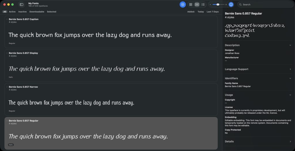
As you may or may not have noticed, I just updated my blog to use my own new typeface: Bernie Sans. It is in the final stretches of development, but I’m pretty excited to share it with you all!

The most exciting development to it since I blogged about it last week, is that it is now a fully fledged Variable Font, and that one of the ‘axes’ it supports is opsz – or Optical Size. This is to say: the font changes appearance depending on how large it is rendered. This is so I can make the font legible at at all font sizes. You can try that out now: try reducing the font size of this page in your browser (Command +/- on a Mac), and see what effect it has! Or take a look at this:
See optical sizing in action – 𐑕𐑰 𐑪𐑐𐑑𐑦𐑒𐑩𐑤 𐑕𐑲𐑟𐑦𐑙 𐑦𐑯 𐑨𐑒𐑗𐑩𐑯
See optical sizing in action – 𐑕𐑰 𐑪𐑐𐑑𐑦𐑒𐑩𐑤 𐑕𐑲𐑟𐑦𐑙 𐑦𐑯 𐑨𐑒𐑗𐑩𐑯
See optical sizing in action – 𐑕𐑰 𐑪𐑐𐑑𐑦𐑒𐑩𐑤 𐑕𐑲𐑟𐑦𐑙 𐑦𐑯 𐑨𐑒𐑗𐑩𐑯
See optical sizing in action – 𐑕𐑰 𐑪𐑐𐑑𐑦𐑒𐑩𐑤 𐑕𐑲𐑟𐑦𐑙 𐑦𐑯 𐑨𐑒𐑗𐑩𐑯
See optical sizing in action – 𐑕𐑰 𐑪𐑐𐑑𐑦𐑒𐑩𐑤 𐑕𐑲𐑟𐑦𐑙 𐑦𐑯 𐑨𐑒𐑗𐑩𐑯
See optical sizing in action – 𐑕𐑰 𐑪𐑐𐑑𐑦𐑒𐑩𐑤 𐑕𐑲𐑟𐑦𐑙 𐑦𐑯 𐑨𐑒𐑗𐑩𐑯
See optical sizing in action – 𐑕𐑰 𐑪𐑐𐑑𐑦𐑒𐑩𐑤 𐑕𐑲𐑟𐑦𐑙 𐑦𐑯 𐑨𐑒𐑗𐑩𐑯
·𐑚𐑻𐑯𐑦 𐑕𐑨𐑯𐑟 𐑦𐑟 𐑩 𐑯𐑿 𐑖𐑱𐑝𐑾𐑯 𐑝𐑺𐑾𐑚𐑩𐑤 𐑑𐑲𐑐𐑓𐑱𐑕
·𐑚𐑻𐑯𐑦 𐑕𐑨𐑯𐑟 𐑦𐑟 𐑩 𐑯𐑿 𐑖𐑱𐑝𐑾𐑯 𐑝𐑺𐑾𐑚𐑩𐑤 𐑑𐑲𐑐𐑓𐑱𐑕
·𐑚𐑻𐑯𐑦 𐑕𐑨𐑯𐑟 𐑦𐑟 𐑩 𐑯𐑿 𐑖𐑱𐑝𐑾𐑯 𐑝𐑺𐑾𐑚𐑩𐑤 𐑑𐑲𐑐𐑓𐑱𐑕
·𐑚𐑻𐑯𐑦 𐑕𐑨𐑯𐑟 𐑦𐑟 𐑩 𐑯𐑿 𐑖𐑱𐑝𐑾𐑯 𐑝𐑺𐑾𐑚𐑩𐑤 𐑑𐑲𐑐𐑓𐑱𐑕
·𐑚𐑻𐑯𐑦 𐑕𐑨𐑯𐑟 𐑦𐑟 𐑩 𐑯𐑿 𐑖𐑱𐑝𐑾𐑯 𐑝𐑺𐑾𐑚𐑩𐑤 𐑑𐑲𐑐𐑓𐑱𐑕
·𐑚𐑻𐑯𐑦 𐑕𐑨𐑯𐑟, 𐑒𐑳𐑥𐑦𐑙 𐑑 𐑩 𐑚𐑮𐑬𐑟𐑼 𐑯𐑽 𐑿!
It’s probably hard to see what is going on here unless you zoom in. The changes are subtle, as you may have noticed. The letters get stretched horizontally ever so slightly at smaller point sizes, and the contrast goes down. Indeed, I toned down the contrast for the ‘normal’ (a.k.a. ‘text’) font sizes, and took it a bit further for ‘display’ sizes. I am not yet fully done with this part of the design, but it is already pretty functional as you can see!
The font also has variable widths:
From condensed to wide – 𐑓𐑮𐑪𐑥 𐑒𐑩𐑯𐑛𐑧𐑯𐑕𐑑 𐑑 𐑢𐑲𐑛
From condensed to wide – 𐑓𐑮𐑪𐑥 𐑒𐑩𐑯𐑛𐑧𐑯𐑕𐑑 𐑑 𐑢𐑲𐑛
From condensed to wide – 𐑓𐑮𐑪𐑥 𐑒𐑩𐑯𐑛𐑧𐑯𐑕𐑑 𐑑 𐑢𐑲𐑛
From condensed to wide – 𐑓𐑮𐑪𐑥 𐑒𐑩𐑯𐑛𐑧𐑯𐑕𐑑 𐑑 𐑢𐑲𐑛
From condensed to wide – 𐑓𐑮𐑪𐑥 𐑒𐑩𐑯𐑛𐑧𐑯𐑕𐑑 𐑑 𐑢𐑲𐑛
From condensed to wide – 𐑓𐑮𐑪𐑥 𐑒𐑩𐑯𐑛𐑧𐑯𐑕𐑑 𐑑 𐑢𐑲𐑛
variable weights:
From normal to bold – 𐑓𐑮𐑪𐑥 𐑯𐑹𐑥𐑩𐑤 𐑑 𐑚𐑴𐑤𐑛
From normal to bold – 𐑓𐑮𐑪𐑥 𐑯𐑹𐑥𐑩𐑤 𐑑 𐑚𐑴𐑤𐑛
From normal to bold – 𐑓𐑮𐑪𐑥 𐑯𐑹𐑥𐑩𐑤 𐑑 𐑚𐑴𐑤𐑛
From normal to bold – 𐑓𐑮𐑪𐑥 𐑯𐑹𐑥𐑩𐑤 𐑑 𐑚𐑴𐑤𐑛
and variable slant:
From normal to italic – 𐑓𐑮𐑪𐑥 𐑯𐑹𐑥𐑩𐑤 𐑑 𐑦𐑑𐑨𐑤𐑦𐑒
From normal to italic – 𐑓𐑮𐑪𐑥 𐑯𐑹𐑥𐑩𐑤 𐑑 𐑦𐑑𐑨𐑤𐑦𐑒
From normal to italic – 𐑓𐑮𐑪𐑥 𐑯𐑹𐑥𐑩𐑤 𐑑 𐑦𐑑𐑨𐑤𐑦𐑒
From normal to italic – 𐑓𐑮𐑪𐑥 𐑯𐑹𐑥𐑩𐑤 𐑑 𐑦𐑑𐑨𐑤𐑦𐑒
but again, its the optical sizing bit that I’m most excited about!
Are there any other variable Shavian typefaces out there that also scale with opsz? Please let me know in the comments! I do wish there were more fonts that supported it, and not just in Shavian, but in general: we need more dynamically scaling fonts. One of the saddest aspects of typography in the modern world is that the introduction of personal computers killed optical scaling – at least for a couple of decades. But it is slowly making a revival: variable fonts have been around for over a decade now, and all modern browsers support them.1
Sadly, it’s just the browsers though.2 Kind of ironically, mainstream word processors are the last tools to get with the program. Microsoft Word and Apple Pages still don’t support opsz scaling, and they actually get rather confused if you throw a typeface at them with too many variations.
Anyway – I am almost done developing Bernie Sans,3 just thought I’d show you my progress! I’ll drop a beta sometime over the weekend (probably.)
𐑝 𐑒𐑹𐑕, 𐑕𐑳𐑥 𐑝 𐑿 𐑢𐑦𐑤 𐑢𐑪𐑯𐑑 𐑑 𐑕𐑰 𐑞 𐑖𐑱𐑝𐑾𐑯 𐑒𐑨𐑮𐑩𐑒𐑑𐑼𐑟 𐑦𐑯 𐑨𐑒𐑗𐑩𐑯 𐑑𐑵! 𐑣𐑨𐑐𐑦 𐑑 𐑩𐑚𐑤𐑲𐑡! 𐑚𐑳𐑑 𐑿 𐑒𐑨𐑯 𐑷𐑤𐑕𐑴 𐑡𐑳𐑕𐑑 𐑑𐑱𐑒 𐑩 𐑤𐑫𐑒 𐑨𐑑 𐑕𐑳𐑥 𐑓 𐑞 𐑻𐑤𐑽 𐑐𐑴𐑕𐑑𐑕! 𐑨𐑟 𐑲 𐑥𐑧𐑯𐑗𐑩𐑯𐑛, 𐑞 𐑣𐑴𐑤 𐑚𐑤𐑪𐑜 𐑦𐑟 𐑯𐑬 𐑦𐑯 ·𐑚𐑻𐑯𐑦 𐑕𐑨𐑯𐑕 🙂
Oh, I almost forgot to mention one of the cooler features… Bernie Sans uses contextual substitutions! Take a look at this sentence in Shavian and see if you see anything unusual:
𐑤𐑱𐑛𐑦𐑟 𐑯 𐑡𐑧𐑯𐑑𐑩𐑤𐑥𐑧𐑯: 𐑲 𐑨𐑥 𐑦𐑕𐑐𐑧𐑖𐑩𐑤𐑦 𐑐𐑮𐑬𐑛 𐑑 𐑩𐑯𐑬𐑯𐑕
𐑞𐑨𐑑 𐑞 𐑓𐑪𐑯𐑑 𐑲 𐑛𐑳𐑚𐑛 ·𐑚𐑻𐑯𐑦 𐑕𐑨𐑯𐑕
𐑦𐑟 𐑪𐑤𐑥𐑴𐑕𐑑 𐑒𐑳𐑥𐑐𐑤𐑰𐑑!
Did you catch it? Subtle, but again that’s kind of the point. In fact, I’ll leave it to the reader to tell me what I did – please tell me in the comments!
-Joro
Footnotes
- Is Edge really a modern browser? If so then that statement is false. ↩︎
- As well as professional desktop publishing and design software such as InDesign, Illustrator, Photoshop, etc. ↩︎
- I still have to fix the italic, bold, and condensed versions, and want to iron out some of the kinks in the
opszinterpolation. The kerning is almost done, but I can see as I type this that there is still some room for improvement. ↩︎
Leave a Reply to Joro Cancel reply